
Colour is one of the most powerful tools in branding and design. It influences emotions, perceptions, and even decision-making. The right colour palette can help your brand stand out, create a lasting impression and build trust with your audience. But how do you choose the best colours for your business? Let’s explore the psychology behind colours and how they impact your brand identity.
Understanding Colour Psychology
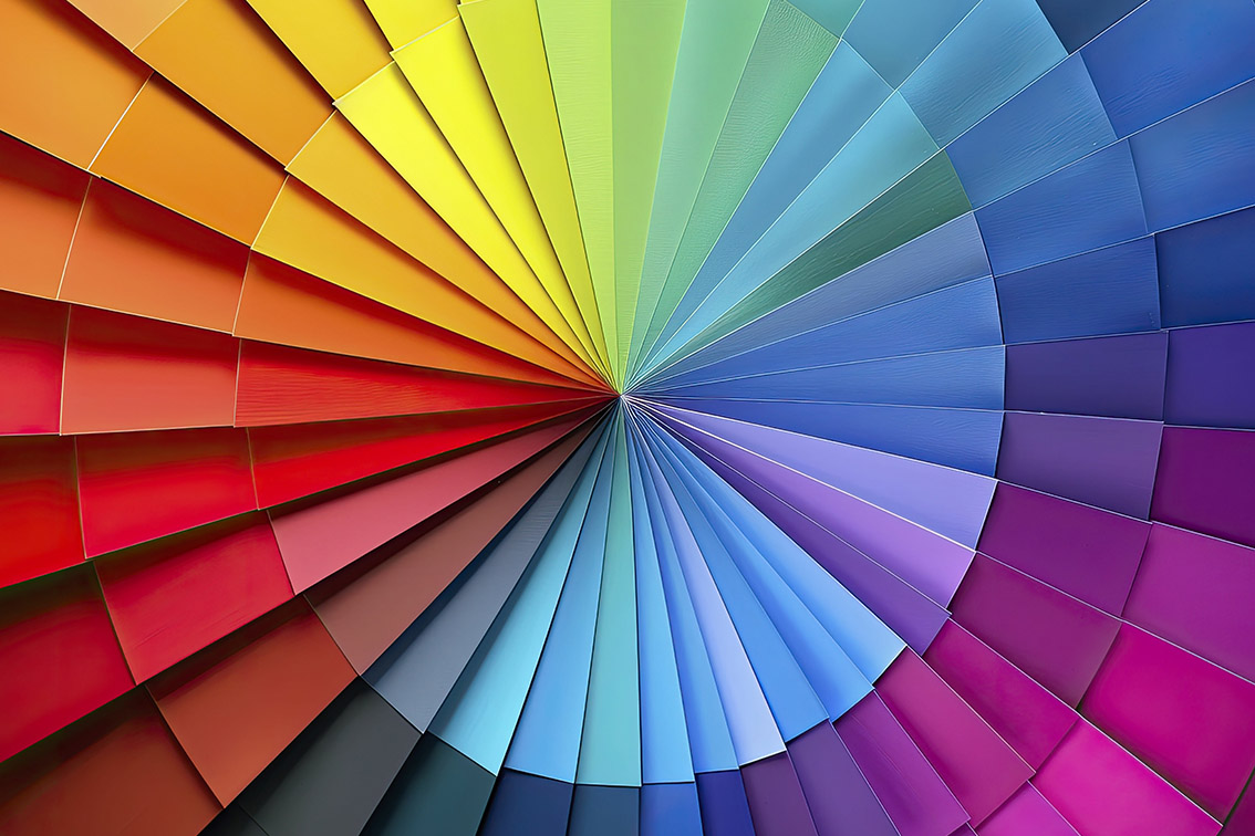
Every colour evokes a different emotional response, which is why choosing the right hues for your brand is essential. Here’s a quick breakdown of some common colours and their meanings:
- Red – Passion, excitement, urgency, and power. Often used by brands that want to create energy or encourage action (e.g., Coca-Cola, YouTube).
- Blue – Trust, reliability, and professionalism. Frequently chosen by financial institutions, healthcare brands, and tech companies (e.g., Facebook, PayPal).
- Yellow – Optimism, happiness, and friendliness. Used by brands that want to appear cheerful and welcoming (e.g., McDonald’s, Snapchat).
- Green – Growth, nature, and health. Popular among eco-friendly brands and wellness industries (e.g., Whole Foods, Spotify).
- Orange – Creativity, enthusiasm, and warmth. Often used by brands that want to appear energetic and friendly (e.g., Fanta, Harley-Davidson).
- Purple – Luxury, creativity, and wisdom. Frequently chosen by premium brands and beauty industries (e.g., Cadbury, Hallmark).
- Black – Elegance, sophistication, and power. Commonly used by luxury and high-end brands (e.g., Chanel, Nike).
- White – Simplicity, purity, and cleanliness. Often used in minimalist and modern branding (e.g., Apple, Tesla).
How to Choose the Right Colours for Your Brand
Understand Your Brand’s Personality
Think about the emotions and values you want your brand to convey. Are you aiming for trust and professionalism? Consider blues. Want to appear fun and energetic? Try yellow or orange.
Consider Your Target Audience
Different demographics react to colours in unique ways. For example, younger audiences may prefer bold, vibrant colours, while older consumers might gravitate toward more muted tones.
Analyse Your Industry
Take a look at competitors and industry trends. While it’s great to stand out, you also want to align with customer expectations. For example, many financial institutions use blue to convey trustworthiness.
Create a Balanced Colour Palette
A good brand palette typically includes:
- Primary Colour: The main colour associated with your brand.
- Secondary Colours: Complementary colours that enhance your design.
- Accent Colour: A contrasting colour used sparingly for emphasis.
Test and Adapt
Don’t be afraid to test different colour combinations and gather feedback. Your brand’s visual identity should evolve with your business and audience.
Need Help with Your Branding?
Choosing the perfect colour palette for your business can be overwhelming, but you don’t have to do it alone. At Mevorra, we specialise in creative and strategic design solutions to help businesses establish a strong, memorable brand identity. Whether you need a logo, a complete brand refresh, or expert guidance on your colour choices, we’re here to bring your vision to life.
Let’s create something amazing together!
mevorra
Contact Mevorra today for all your branding and design needs.